Science fiction is the most important phenomenon of twenty-first century Sinophone literature. By the end of the last century, Hong Kong’s Dung Kai-cheung and Chan Koonchung; China’s Liu Cixin, Han Song, and Wang Jinkang; Taiwan’s Lucifer Hung, Chi Ta-wei, and Andrew Yeh; and overseas writer Chang Shi-Kuo, among others, have all written about time travel, interstellar war, alien monsters, biochemical weapons, the earth in crisis, utopias and dystopias, and other subjects outside of mainstream realist fiction. Large-scale works such as Liu Cixin’s The Three-Body Problem and Han Song’s Tracks and Hospital either conceive of the last struggles of human civilization in the face of extinction by alien invasion or reflect on the Kafkaesque confines of the human condition. While these works engage shrewdly with grand themes, they also lead the reader into unknown worlds and give access to unrevealed visions. Dung Kai-cheung’s Histories of Time offers retrospective accounts from the future of a submerged Hong Kong, while Chan Koonchung, who once lived in Beijing, concocts a socialist heterotopia connecting past to future.
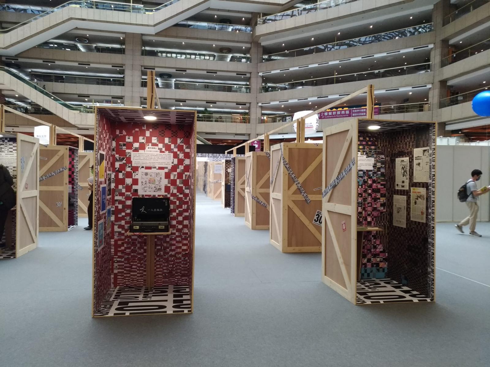
Science fiction in Taiwan has not been able to develop its own climate, but this has not prevented dedicated writers from experimenting with form and imagining alternate realities. Lou Yi-Chun’s Daughter deploys a knowledge of quantum mechanics and artificial intelligence while reversing typical understandings of moral realism and gender roles. In Kuang Chaoren, Lou incorporates the astrophysics of black holes and white holes into a creative landscape wherein pathological changes in the human body create cracks that allow glimpses into celestial storms. The setting of Lou’s Ming Dynasty pays homage to Liu Cixin’s The Three-Body Problem. In the story, a robot transmits data on the Ming Dynasty to another galaxy as the blueprint for a future civilization. Egoyan Zheng’s Ground Zero imagines the causes and consequences of a Taiwanese nuclear power plant explosion and the strange visions brought about by the catastrophe, no less than a tribute to the novel The Ruins of Taiwan by Sung Tse-lai, a writer of a prior generation.
All these works can be categorized as science fiction, but they have won the attention of readers not only because of their authors’ fantastical imagination and how they cross the boundaries of realism. As science fiction theorist Seo-Young Chu reminds us, the subjects tackled by science fiction narratives are not themselves fantastical. On the contrary, they may be more real than the realities of realist fiction. Chu even believes that all literary creations are works of “science fiction” that turn vulgar matters into magic. The techniques of reenactment and mimesis that realist fiction relies on are only the first step. Science fiction’s ability to reflect on and reconstruct inconceivable, inexplicable reality is what truly demonstrates the power of literature to turn the imaginary into the real. More important, Chu argues that the basic unit of science fiction is the poetic or lyric metaphor – it uses the complex twists of figurative language to turn the “dream world” into narrative expression.
If so, what are the metaphors in Egoyan’s science fiction compared to that of his contemporaries? Liu Cixin is concerned with the state of emergency before the collapse of human civilization; Han Song is always mired in the claustrophobic syndromes of a black box (China!); Lou Yi-Chun specializes in abject and impossible to unravel ethical farces; the clock of Hong Kong under Dung Kai-cheung’s pen ticks haphazardly; Chan Koonchung’s world is filled with conspiracies that appear in the full light of day. In contrast, Egoyan’s works are more involutionary, like Rubik’s cubes or Russian nesting dolls, spiraling, overlapping, and recursive. Historical, political, ethical, and gender issues all revolve around his surveys of intimate relationships, and all his plot points and characters ultimately point toward the topology of love.
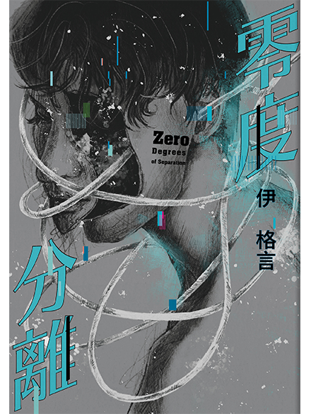
Egoyan believes that love is the most wondrous variable separating humans from non-humans. Each story in the collection sets up a dialogue or argument about love. In “The Masaki Nikaido Virtual Idol Scam”, the main character willingly invests her life into a lover she meets in dreams. She has no regrets, having asked herself: “Am I afraid of a life without love, or am I afraid of a life without companionship?” In “The Rest of My Life”, an actress and director couple pursue the zero degrees of separation found in perfect love, unable to bear the compromise of anything that “also counts as love”. They experiment with their neurobiologies and do not hesitate to replace their lives as human beings. In “The Dream Projection AI Uprising Against Humanity”, The Phantom, an imprisoned AI creature, shows disdain for humans but is speechless when asked, “You have no desire to reproduce, so are you not capable of love?”. In “Lights in the Mist”, the prevailing church of “Global Consciousness” look negatively on all beliefs, as well as the human capacity for rationality and cognition. They work hard to purge all notions of divine will and all prior philosophical ideas about transcendence in order to become a cleaner species. But while the survivors of the slaughter speak eloquently of their anti-faith beliefs, they are at a loss to explain the origins of “sentience” and its associations with love.
A dialogue within the fake book’s fictional afterword is rich with meaning. A reporter meets with a virtual pornography mogul to discuss the ways in which human dreams are put into practice. While the survivors of the Global Consciousness cult express their doubts about human cognition and propose cutting the body off from the soul as a way to achieve zero degrees of separation, the porn mogul chooses to go in the opposite direction and uses the most advanced dream making techniques that customizes for all erotic needs, attaining zero degrees of separation through fantasy and pleasure. The climax of their dialogue reveals a shocking clue that leads to another variation of the love-dream debate.
The first story in Zero Degrees of Separation, “Say I Love You Again”, points to “unfulfilled dreams and the deprivation of love” as the origin points of human trauma. In the story’s climax, a scientist obsessed with cetaceans at the neglect of her child suddenly says “I love you” to her son while in the final stages of developing a cetacean neurobiology. These are human words spoken in the language of orcas. The moment presents a convergence of death and life, fire and light against the night roar of the sea, a place where happiness and the end of happiness are indistinguishable. Is love a miracle? Is it the perfect culmination of a made-up dream? Or is it the most mysterious aspect of being human? Egoyan voices the baffling questions of the posthuman era in the most lyrical terms without giving a definitive answer.
“The source of love is not known; it only grows deeper.” The bewilderment and lament of the pre-modern dramatist Tang Xianzu still echoes in our posthuman century. In Tang’s classical romance, love’s greatest dimension is that the living may die of it, while the dead may live again through it. If so, a work of science fiction like Zero Degrees of Separation subtly tells us that a posthuman life is always the life of a survivor: the meaning of love begins with picking up the wreckage of (imagined) love.
3.jpg)