ABOUT LATEST BOOKS AUTHORS TRANSLATORS EVENTS RESOURCES FELLOWSHIP GRANT

LATEST

  • Rekindling the Passion for Classic Taiwanese Cinema: Jian Jia-Cheng on Creating Comics with a Purpose
    Dec 21, 2021 / By Jian Jia-Cheng ∥ Translated by Joshua Dyer

    This graphic novel was published in conjunction with the Taiwan Film Institute. Could you describe the process of collaboration? How was the subject of the book decided? How were the historical materials gathered? And how did you organize these materials to create a compelling storyline?

    Actually, it was a very open process. The institute has a large historical archive – film, newspapers, data on actors and movie industry workers, old equipment – pretty much every kind of historical material from the post-war period. It’s a treasure trove. They gave me full rein to choose whatever topic I wanted. The bygone studio back lots setting of the first volume was meant to draw attention to the core work of the institute – film restoration – since this was our first collaboration.

    Film restoration requires a lot of technical knowledge, but (I focused on) the why of it. What makes these old films so important that we need to restore them? If readers don’t understand the lost era of Taiwanese-language cinema, if we can’t generate an emotional connection to these films, they will lose their significance. Then who cares whether they are restored? So the story had to help readers understand the 1960s golden era of Taiwanese cinema. Just setting this premise was already a huge undertaking. I had to acquire a thorough knowledge of the filmmaking process of the era – cinematography, lighting, printing, tracking… Only with this knowledge could I understand the difficulties faced by filmmakers of the time. What were the post-production costs? Why were budgets so limited? Only then could I depict the passion of these characters who persisted in making movies despite living in an era of such limited resources. I hope readers will feel that passion, and perhaps better understand why we should treasure these films. Then maybe they can appreciate why it is such a precious opportunity to see them shown again on the big screen.


    Your previous book focused on the subject of film restoration. The current one focuses on the art of hand painted film posters and billboards. Are there any interesting anecdotes you can share from the process of developing these graphic novels?

    While drawing the previous book I accompanied the Taiwan Film Institute team on a trip to Taichung to better understand the film restoration process. We went to a warehouse on the outskirts of the city, where, along with a bunch of other junk, there were these neat stacks of film canisters. The family of the warehouse owner once ran a business showing open air movies in the squares in front of local temples. That’s why all of this stuff was there.

    The team carried out all these dusty canisters and stacked them in their truck one by one – it was hard physical labor! I thought about everything that would happen next – each would have to be carefully inspected back at the archives and ones that were too badly decayed would be thrown out – so much work. But somewhere in that stack of canisters they might find a lost film. The work of saving old films is so labor intensive, and sometimes you find nothing at all. It’s a bit like panning for gold. But it is still necessary.

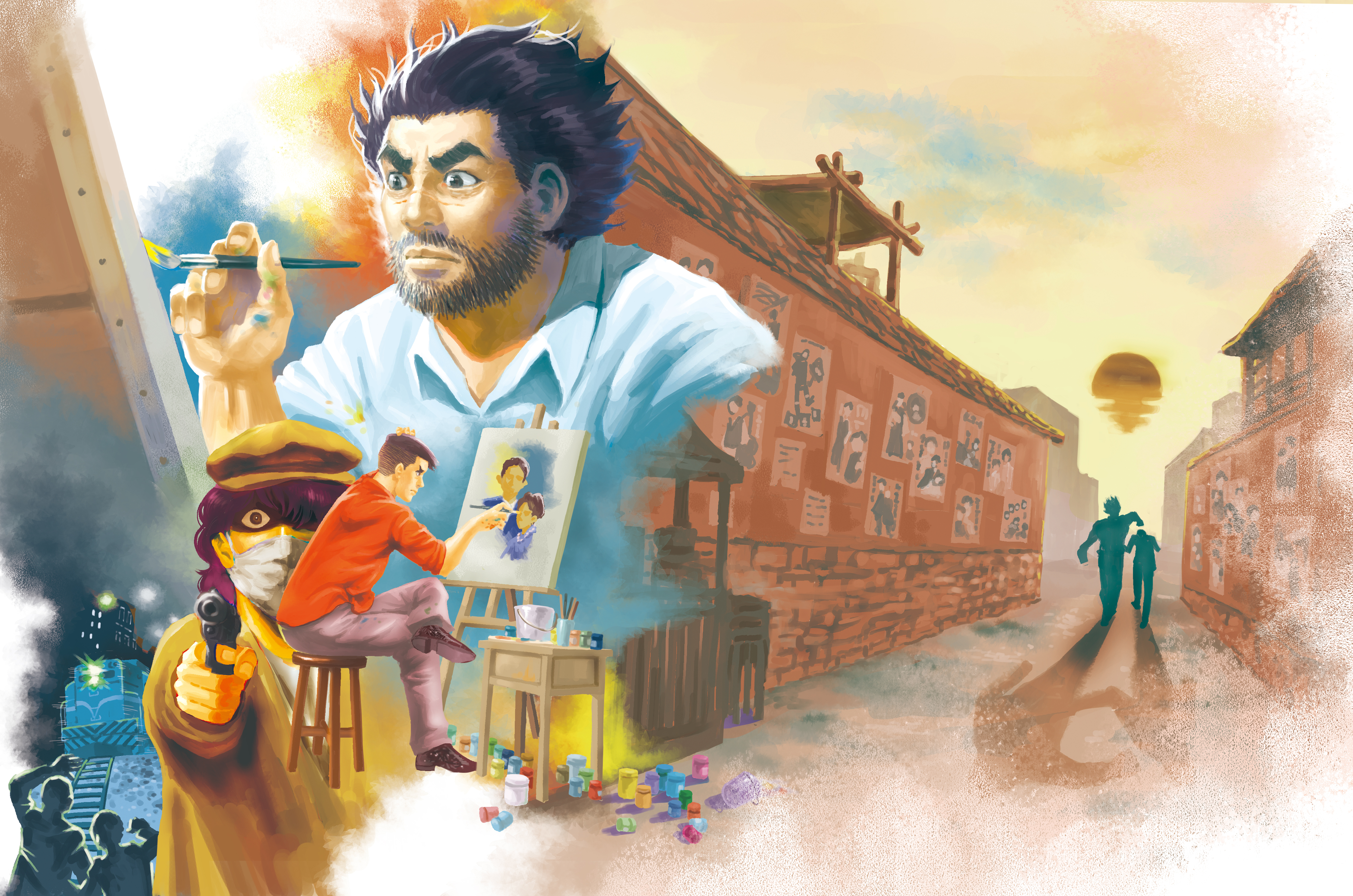
    While I was collecting material for the second book, I came across an interesting fact: sometimes the people painting the posters didn’t know what would be in the movie! Because there was a mad rush to produce these Taiwanese-language films, sometimes studios ran short of cash, so they would go to the movie theaters begging for capital. The movie theaters needed to show movies to make money, and generally the movies would be profitable as long as they controlled costs. So the theaters would agree to invest, but they needed some kind of guarantee that the studio would actually complete the film. The movie poster was the guarantee. The studio would take photos of their actors and some preliminary plot sketches to the poster artists, and from this limited information they would have to create a poster as if the movie already existed. The studios could then take the poster to the movie theater to request funding. To me, this was a really interesting way of doing things.


    We’ve heard that the character of the painter in the book is derived from Chen Tzu-Fu, an famous painter of movie posters from the period. How much of the original Chen Tzu-Fu remained once you were finished molding the character? Why did you retain these parts of Chen Tzu-Fu’s life?

    Two painters, Chen Tzu-fu and Juan Ta-yung, supplied elements of the character, though I took greater inspiration from Chen Tzu-fu. Because Chen Tzu-fu was recruited into the Japanese army, and because at the time I was reading Wu Ming-Yi’s The Stolen Bicycle which talks about the experiences of Taiwanese soldiers in Southeast Asia, I started to form this image of a macho, tough-guy sort of painter. Since he lost his arm in the war, the image also became associated with the character of Yang Guo from Legends of the Condor Heroes, and that set the form of the character.


    What’s your impression of Taiwan’s hand-painted movie posters? Can you share with our readers your favorite poster?

    The beauty of hand-painted movie posters can’t be captured in reproductions. The way the text and images are arranged reveal a lot about the careful thought that went into compositions, as well as each artist’s individual style. You can spend a lot of time just admiring this aspect of the art form.

    There are so many that I like, but I’ll share a bit about one from the movie Son which left a deep impression. You see three siblings on the train tracks. The son is blind. The middle sister is mute, and oldest sister leans on the middle sister because she can barely stand. Behind them, you can see the train hurtling towards them. From this image you can get a sense of the tragic character of so many Taiwanese-language films. You break out in a cold sweat seeing what could happen to the three siblings. I think this is a classic example of a poster that can stir the viewer’s curiosity about the movie.


    A number of movie posters make appearances throughout the course of the graphic novel. Is there one that you particularly liked? Can you tell us why?

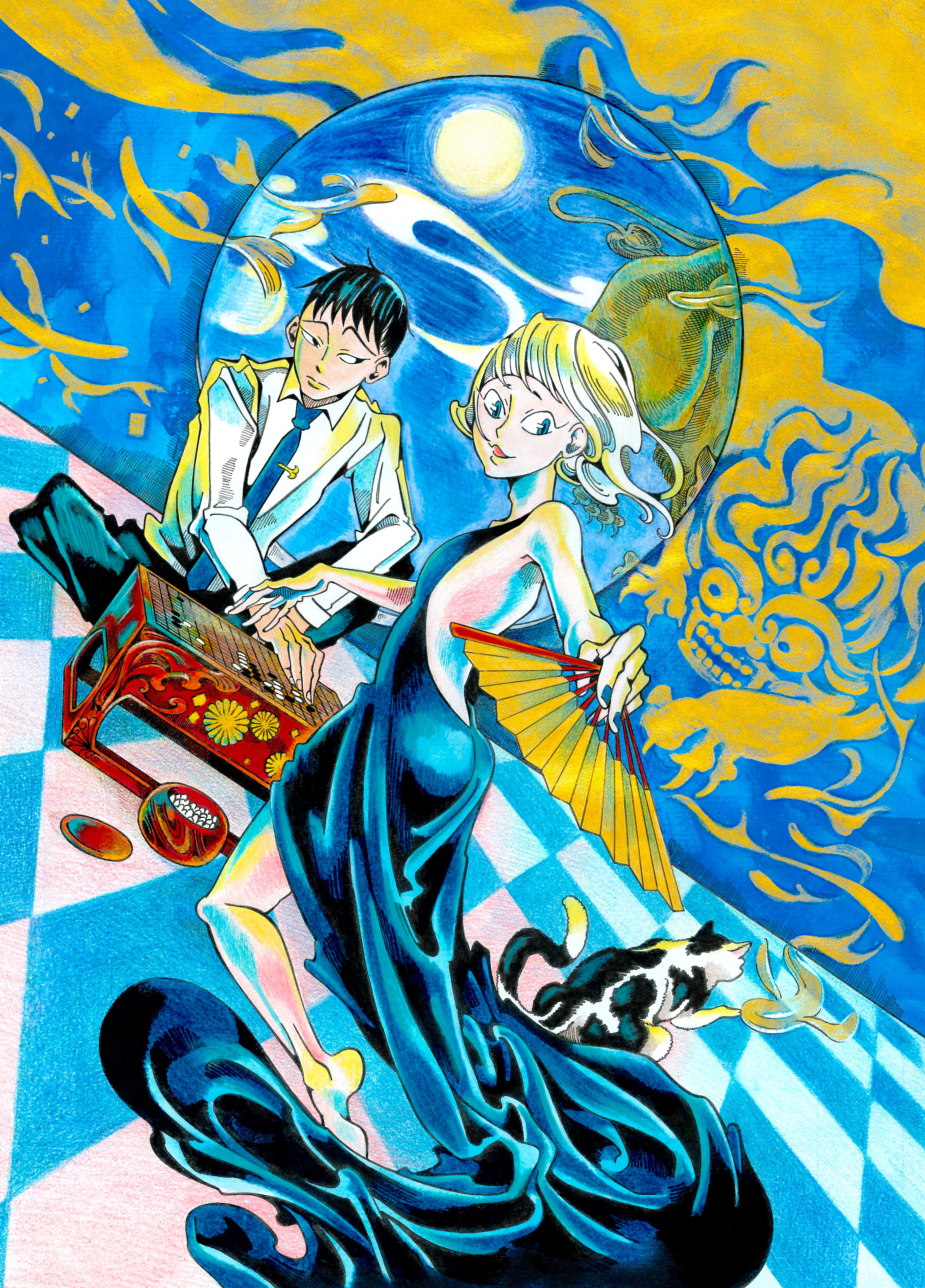
    My favorite is probably the poster for Heaven and Earth Sword, an wuxia, or martial-arts adventure film. Chen Tzu-fu had a lot of experience painting wuxia posters. He once said painting wuxia posters was second nature to him, and it really shows in his compositions and technique. I wanted to draw something like one of his posters, so for me it was a pleasure to envision this poster and draw it into the graphic novel.


    Read more:
    - Jian Jia-Cheng: https://booksfromtaiwan.tw/authors_info.php?id=93
    - The Movie Painterhttps://booksfromtaiwan.tw/books_info.php?id=383

  • A Flash of Recognition: How Go, Manga, and Stefan Zweig Cross Paths in THE LION IN THE MANGA LIBRARY
    Dec 21, 2021 / By Xiaodao ∥ Translated by Joshua Dyer

    One intriguing aspect of the graphic novel is how it brings together two seemingly distant subjects: the strategy game go, and Taiwan’s manga rental industry. Can you share how you came up with this setting for your book?

    I’m obsessed with the idea of rebellious acts, like “escaping from the world”, or “straying from the usual path”, so I decided the main character should be an “escapist”. I made her a professional go player since the game has been an interest of mine for many years. The decline of the manga rental shops makes them a setting that can evoke a lot of stories and memories, and they are just the sort of place an “escapist” would go to get away from the world.


    How did you organize the materials gathered from your interviews and observations and apply them in the graphic novel? Can you use some concrete examples from the book to demonstrate?

    The presentation of the basic information about go and the psychology of the game came from my personal experiences as a player in addition to what I learned from interviews with professional players and my observation of tournaments. The specific game layouts (used in the graphic novel) were taken from recorded professional games in Taiwan, and from the records of AlphaGo games.

    For information about the world of manga rental shops I visited a platform called Zu Meng Wang (Dream Rental Net) where industry people gather, interviewed some shop owners, and did on-site observations of their workflow and working environment. All the details of the process of closing down a shop and the warehouse environment that appear in chapters four and five come straight from my memories of those visits.


    The plot is mostly driven by the two main characters. Could you walk us through your process of developing these characters?

    The model for Winter is Dr. B from Stefan Zweig’s novella The Royal Game. Dr. B developed his prodigious chess ability as a distraction while imprisoned by the Nazis, but when he exercises his abilities in an intense game, it nearly drives him mad. The source of Hsia-sheng’s character is the suffering and pain I’ve witnessed in people around me. He is a composite image of all victims of abuse, bearing witness to the intergenerational trauma, and the deep and seemingly irresolvable resentment that results.


    Your graphic novel has go scenes drawn in the style of shonen manga (action comics targeted at teenage boys), the emotional content of shojo manga (sentimental manga targeted at teenage girls), and the real-world observation and detail of workplace manga. Taken together, it becomes hard to categorize. How would you define your work, or, how would you suggest that readers approach it?

    My creative work always contains elements that are rearrangements of my own experience. But because I am limited by what I know, I also have to draw from others. This graphic novel grew out of the life experiences of quite a few different people, incorporating them into a collage of life-fragments. Within these somewhat arbitrary experiences, I hope that readers will feel a flash of recognition, a resonance of feeling that lingers even after they put the book down.


    Read more:
    - Xiaodao: https://booksfromtaiwan.tw/authors_info.php?id=367
    - The Lion in the Manga Libraryhttps://booksfromtaiwan.tw/books_info.php?id=382

  • Easy on the Eyes: Comic Book Maestro Ren Zheng-hua on Mastering the Art of Visual Storytelling
    Dec 21, 2021 / By Ren Zheng-hua ∥ Translated by Joshua Dyer

    This humorous comic is a light read. For the most part I avoided using screentones, kept the linework simple and clean, and eschewed distorted perspective and composition, the goal being to make it easy on the reader’s eyes. My hope is that it can easily be read while seated, or lying down, or lying flat on ones stomachs, or on the toilet… or maybe even while stuck in traffic, or while the colors of sunset melt into the sea, or while taking a break from playing mahjong, or at anytime it might help you thoroughly relax and regulate your emotions. For this reason, while drawing it, I tried out lots of different light and reading angles, and only after being sure something wouldn’t strain the eyes did I dare set it in ink. After all, unveiling a work of comic book art means assuming a responsibility to the public. Think about all the parents who scold their children, screeching, “Those comic books are ruining your eyes!” The creators of comic books, never being in the position to make a rebuttal, can only accept this calumny as one accepts an oncoming natural disaster.


    The Human Bun was first serialized in China Times Weekly starting in February of 1992. An extended version was printed in New Youth Express starting in February of 1993. I want to give special thanks to these two periodicals for giving me the opportunity to test my abilities and hone my craft. Prior to The Human Bun I went through a period of struggling and eventually reinventing my style. Much of the credit goes to the “drills” I went through at China Times Weekly. It was at New Youth Express that I first began working on composition and panel layout with the goal of making everything “easy on the eyes”. I had to cut up my original art, add new material, and re-edit everything back together. It was a lot more tiring than simply re-drawing from scratch, but it forced me to understand the relationship between the eyes and the pacing of the story. I treasure these experiences for the lessons learned, and hope to continue to improve in whatever works I produce in the future.


    Read more:
    - Ren Zheng-hua: https://booksfromtaiwan.tw/authors_info.php?id=366
    - The Human Bun: https://booksfromtaiwan.tw/books_info.php?id=381

  • From Peking Opera Actress to Superhero
    Dec 21, 2021 / By Chang Sheng ∥ Translated by Joshua Dyer

    I’ve heard that my grandfather was quite the dandy when he was young. His favorite pastime was acting in amateur Peking Opera performances.

    According to my admittedly fuzzy memory, when I was a toddler, my grandfather and I often went to watch Peking Opera performances at Pao Fu Kung, a temple in Taipei’s Yonghe District. I didn’t know a thing about opera, but the female characters in particular left a deep impression. They cut such striking figures on the stage, sometimes delicate and graceful, sometimes sharp and forceful. Those impressions have stayed with me, and often linger in my thoughts. It might be a snatch of reserved and elegant song, or the thrust of a sword or spear in a martial dance. To me, all of these performances are beautiful.

    About five or six years ago, a thought occurred to me. Iron Man, Batman, Kamen Rider… so many superheroes wear masks to conceal their identity. But if a superhero were to paint their face like they do in Peking Opera, they wouldn’t need a mask.

    I’ve always believed good stories usually arise out of a core concept that is powerful, yet ridiculously simple. But combining science fiction and traditional opera seemed far too ambitious. I hesitated, wondering if I could pull it off. However, one concept was just too compelling. It captivated me and became a vehicle for all those beautiful impressions of Peking Opera from my childhood. I simply had to draw it.

    That concept was Yan, the story of a Peking Opera actress turned superhero.


    About the Title Calligraphy

    It is a great honor, and my good fortune, that the calligraphy of octogenarian manga master Hirata Hiroshi appears as the title characters of this graphic novel. Mr. Hirata is famous throughout Japan for his samurai-themed manga. His vigorous calligraphy also appears on the original posters for world-renowned anime classic Akira.

    When I received the original of this monumental calligraphic work, I felt it as a blessing for the project. Of course, I also felt immense pressure. I had to produce the best graphic novel I could, no matter what the cost. My deepest gratitude to Mr. Hirata Hiroshi and to Mr. Wu, who surreptitiously arranged everything and made the trip to Japan to collect the artwork and deliver it to me.


    Read more:
    - Chang Sheng: https://booksfromtaiwan.tw/authors_info.php?id=89
    - Yan: https://booksfromtaiwan.tw/books_info.php?id=380

  • Taiwan’s History Through an Ordinary Life: An Interview with the Author and the Illustrator Behind SON OF FORMOSA (II)
    Jan 26, 2021 / By Anting Lu ∥ Translated by Joshua Dyer

    Read Previous Part: https://booksfromtaiwan.tw/latest_info.php?id=118


    Images Reveal the Feelings Beyond Words

    Zhou Jianxin’s ample experience illustrating picture books informs his creative approach to this long-awaited challenge: his first full-length graphic novel. He explains that graphic novels are usually fast paced, narrating a complete event within the space of a page. But Mr. Tsai’s story contained emotional tones that needed to slowly steep before their impact could be fully felt, such as the homesickness, melancholy, and cherished ideals that are conveyed by the aforementioned songs. At these moments, Zhou Jianxin uses the full-page and multi-page spreads so common in picture books to create a sense of stillness, slowing time within the progression of images to allow for sustained emotional development.


    Zhou Jianxin


    The well-thought out variations in color scheme and illustration techniques used in each volume are another highlight of these books. In the first volume Mr. Tsai’s childhood memories are represented by unfussy sketches touched up with pink watercolor for skin tones, a color which also symbolically hints at the red of the Japanese imperial flag. The second volume digitally emulates the relatively stiff forms of ink woodblocks to bring out the dreariness of internment, only introducing color upon Mr. Tsai’s release as he is greeted by the sight of the blue sky and ocean. The third volume, in which Mr. Tsai founds a children’s magazine, Prince, echoes Japanese manga in its use of effect lines and screen tones, accentuating the retro vibe with its maize and maroon palette. The artwork of the as-yet-unreleased fourth volume utilizes modern illustration techniques paired with bright orange accents for a more contemporary feel. By laying out a comprehensive and precise design plan for the entire series, Zhou Jianxin hoped to better convey the passage through the phases of Mr. Tsai’s life. His intent is to use “lines to convey feelings, technique to convey the era”.


    Because Son of Formosa is based on the life of a living individual, the creators were both nervous and excited to pass their drafts to Mr. Tsai for review. “Only he could discover those details which we knew nothing about,” Zhou Jianxin says with a laugh. Mr. Tsai’s personal feedback led to the incorporation of additional details for readers to enjoy, like the carved floral ornamentation on the table in his childhood home, and the stage from which the Japanese officers announce the end of the war. “This wasn’t a story we invented on our own. We were concerned about how we represented this living person, and wanted to minimize mistakes.” From the beginning, Zhou Jianxin felt a deep calling to faithfully depict Tsai Kun-lin’s life.


    Zhou Jianxin


    Reading as a Personal Experience of Collective Memory

    At the end of the interview the conversation turns to Son of Formosa’s potential in foreign markets. Yu Peiyun is forthright in her insistence that comic books and graphic novels are a gentle medium, free from the stimulating lights and sounds of high-tech entertainment. Readers can choose a solitary moment to quietly digest a work, giving space for emotional currents to be drawn out in their own time. This kind of reading experience is cherished around the world, allowing comic books and graphic novels to easily cross borders.


    While the story of Son of Formosa is a microcosm of Taiwan’s journey through the modern era, from colonization, to totalitarianism, to democracy, these elements of collective memory are not exclusive to Taiwan’s people. They are greater than the history of a single nation. “To international readers,” Yu Peiyun reflects, “Taiwan may seem like a far-away place, but possibly their own country, or neighboring countries, have a similar history. These feelings are something we hold in common.” The potential of Son of Formosa is not only to provide international readers a window on Taiwan. More importantly, it will resonate with ordinary people in all countries who feel caught up in the great tides of history. 

  • Taiwan’s History Through an Ordinary Life: An Interview with the Author and the Illustrator Behind SON OF FORMOSA (I)
    Jan 26, 2021 / By Anting Lu ∥ Translated by Joshua Dyer

    Son of Formosa, the first graphic novel series from Slowork Publishing, depicts the milestones of Taiwan’s modern history seen through the life story of Mr. Tsai Kun-lin. Within its pages, readers witness the shifting panorama of the eras of Japanese colonization, post-war retrocession, the White Terror, the lifting of martial law, and the coming of democracy. Combining the spare but powerful text of author Yu Peiyun and the sensitive artwork of Zhou Jianxin, the four volume series is more than the story of one man – it is a vessel for the memories of an entire generation of Taiwanese.


    An Ordinary Life: History in Miniature

    Author Yu Peiyun laid eyes on Mr. Tsai Kun-lin for the first time in 2016. At the time she was assisting with an exhibition of writings by victims of the White Terror being held at National Taitung University, and Mr. Tsai attended the opening as an honored guest. The man Yu Peiyun witnessed that night was spry, radiant with energy, at once modest and warmly engaging. Having some understanding of his life experiences, she couldn’t help but wonder, “How could someone who had endured so much give the impression of such warmth and wisdom? Coming into contact with him was refreshing, as if he had the heart of an innocent child.” As she listened to him sharing his memories, the impulse kept welling up inside her to record the story of his life.


    (from left to right) Yu Peiyun, Tsai Kun-lin, and Zhou Jianxin


    As both a scholar and author of children’s books, Yu Peiyun had discovered that most of the children’s literature available in Taiwan came from overseas. “But we have such rich history and stories of our own,” she relates, “They should be written down.” For this reason she decided to collaborate with Slowork Publishing to produce a book focused on Taiwan: a detailed life history of Mr. Tsai Kun-lin that would serve as a portrait of an era in miniature.


    Sleuthing for Source Materials: Piecing Together Taiwan’s Unique History

    A work of historical biography cannot be undertaken without first gathering a rich array of source materials. Mr. Tsai had already published a personal memoir, so Yu Peiyun focused on researching details of everyday life that she could write into the story in hopes of striking a chord with readers. One such detail appears in the second volume, as political prisoners are moved to Green Island for internment. Upon seeing the prisoners, the local inhabitants are shocked. “They’re so pale. They look like white woodlice,” they say, comparing the malnourished prisoners to the thin-limbed crustaceans that inhabit the island. In confusion they ask, “They’re all people? Why were we told they were apes (sing-sing)?” The island’s inhabitants had been told that “new students (sin-sing)” would be arriving, a euphemism for prisoners which is also a near-homophone for apes in Mandarin. Humorous details such as these come directly from Yu Peiyun’s research, and were incorporated to more accurately recreate the atmosphere of the times. Yu Peiyun jokes that her research was a bit like solving a historical mystery. Since Mr. Tsai couldn’t possibly provide all of the details to recreate an entire era, it was left her to track down the missing pieces of the puzzle. Fortunately, Yu Peiyun relishes detective work.


    In addition to finding historical information to weave into this moving tale, Yu Peiyun put a great deal of thought into the presentation of the story. The title, Son of Formosa (Child of Qingshui District in Chinese) indicates how she differentiates her approach from that of conventional memoirs covering this period of history. She hopes to clear away the clouds of misery and suffering associated with the era, erasing the usual labels, and instead convey that same impression of purity she had on first meeting Mr. Tsai. Although he had lived through political and national upheavals, in the end he was still that innocent child of Qingshui District–a son of Formosa.


    A number of period songs also appear in the books. Yu Peiyun relates that Mr. Tsai is a music lover with a fine singing voice, for whom music has an almost redemptive power. Inserting interludes of song into the story highlights this aspect of his character, showing readers how his singing restored his spirits in times of hopelessness and kept the taste of freedom alive in his heart through the darkest years of his imprisonment.


    Read on: https://booksfromtaiwan.tw/latest_info.php?id=119

  • A Man with Nine Lives: An Interview with the Author of NINE LIVES MAN: TIME'S WHEEL (II)
    Jan 26, 2021 / By Bernie Yang ∥ Translated by Joshua Dyer

    Read Previous Part: https://booksfromtaiwan.tw/latest_info.php?id=116


    Sharp-eyed readers may notice a number of Easter eggs planted throughout the comic that have real world correspondences. The publication dates of the series echo the dates of events in the fictional timeline or publication dates of fictional books in the story. These carefully scripted links help create the surreal sense of the interpenetration reality and fiction. Chang Sheng also hoped to maintain some implicit connections to the original series. The period of the original comic is referenced in the Prince album Purple Rain, which appears several times as a device to move the plot forward. In the original comic, Guy Ninemann reincarnates as a variety of life forms, including a dog or a tree. Chang Sheng kept the idea, but changed the specifics, having his Guy Ninemann reincarnate as a robot and a bear.


    The cover of the comic book is no exception to the meticulous planning characteristic of the project. Chang Sheng worked with the publisher to ensure that no writing would appear on the outside jacket. By leaving only a symbolic representation of the number nine to hint at the contents, Chang Sheng hoped to leave space for readers to form their own interpretations.


    Persisting in the Face of a New Challenge: the Warmth of Hand Drawn Art

    Time’s Wheel presented a major challenge to Chang Sheng. It was the first time in his more than ten years of drawing comics that he forwent the use of computer technology, instead producing the art completely by hand. The new approach allowed him to leave a physical record of his progress in the form of the original artwork.


    When discussing his work habits, Chang Sheng reaffirmed his belief that maintaining consistent hours and consistent output is the only way craft a superior comic. To stay on schedule he had to work roughly ten hours a day. However, because he was more familiar with computer art tools, producing art by hand took roughly three times as long.


    With the additional time required to collect the reference materials on which he bases his realist art style and develop the various links between the real world and the fictional world of the comic, Chang Sheng was soon barely coping with the pressures of staying on schedule. When he was close to missing a deadline, he reluctantly requested aid from his old assistant, the computer. After submitting his work, he couldn’t help joking with himself: “It’s a good thing I’m working on Nine Lives Man. Without nine lives, I’d be dead by now!”


    High-Concept Comics Translate Better to International Markets

    In recent years Chang Sheng has established a formidable track record, winning numerous national and international awards, and selling overseas translation rights in a variety of foreign markets. But if you ask him if he’s satisfied with his work, he responds with characteristic self-deprecating humor: “Ask any creative person. They’ll always say they’re unsatisfied!” But he does admit to a significant point of pride which may be the key to his headway in foreign markets, namely, his works are built around simple, but powerful, core concepts that transcend the demands and orientation of the market.


    A concept that’s good enough will always attract readers. When paired with art that presents a clearly distinct visual style, you’ve got a comic that directly impacts the reader, thus transcending the language barrier. Nine Lives Man: Time’s Wheel is a stellar comic book that succeeds in shaking up conventional notions of time and reincarnation. With a high-concept plot and painstakingly detailed artwork, it seems destined to shake up international comic book markets as well!

  • A Man with Nine Lives: An Interview with the Author of NINE LIVES MAN: TIME'S WHEEL (I)
    Jan 26, 2021 / By Bernie Yang ∥ Translated by Joshua Dyer

    In 1985, Taiwanese comic artist Push released his highly original sci-fi comic book Nine Lives Man. The comic inspired a generation of readers as they followed the adventures of Guy Ninemann, a man who unwittingly receives nine lives, as he travels between Heaven, Hell, and the mortal realm. One of those young fans was Chang Sheng. In 2018, Chang Sheng, now a comic book artist in his own right, enlisted Push and three other artists to create new interpretations of the classic. With no restrictions on genre or style, the artists agreed only to follow the core concept of “a man with nine lives”.


    Calling All Artists: A New Edition of Nine Lives Man

    According to Chang Sheng, a comic book becomes a classic because it has some element which transcends the era in which it was created. In the case of Nine Lives Man, the core concept of a man having nine lives always intrigued Chang Sheng, but, as a comic creator he felt frustrated that he couldn’t run with an idea that was not his own. That frustration remained until five years ago, when, through a twist of fate, he had the opportunity to ask the original creator Push if he could draw his own version of Nine Lives Man. He never imagined Push would agree right on the spot, initiating a unique creative project never before seen in the history of Taiwanese comic books.


    Drawing inspiration from the prominence of the number nine in the original comic, Chang Sheng wanted to invite nine different comic book creators to participate in the publication of a nine issue series to be released on September 9th, and later release a compendium of the series in 2019. He even hoped to curate an exhibition about the project, among other ambitious ideas. After pitching the concept to publishers and artists across the industry, he was able to recruit only five artists, including himself and the original creator, Push. Although the scale of the project fell short of the original conception, the five artists set to work based on the core concept of “a man with nine lives”. Their creations span the gamut of styles from sci-fi to fantasy to thriller to romance, and even include a sequel that picks up thirty years after the timeline of the original. Taken together, the multiple versions of Nine Lives Man constitute a sumptuous visual feast.


    Chang Sheng relates a number of curious episodes from the process of creating the series. The group first began their discussions at a coffee shop called R9. The number nine appeared again on Chang Sheng’s bus ride after the meeting. After deciding to dedicate himself to the project, he began to pay more attention to where the number nine appeared in his life, taking it as a lucky number. Only then did he discover that traces of the number nine ran everywhere in his life.


    From Nine Lives Man to Time’s Wheel

    Following the plan of the original, Chang Sheng’s Nine Lives Man: Time’s Wheel, tells the story of Guy Ninemann, a man with nine lives, who incarnates as various people (and life forms) to avert a city-wide bomb attack. In the various bodies of a police detective, a prisoner on death row, a writer, a little girl, a grandmother, a robot, and even a bear, he returns again and again to the scene of the incident to see if he can prevent the catastrophic loss of life and untold suffering that unfolds. The story subverts linear time, as well as traditional notions of reincarnation, as the successive lives of the protagonist overlap and interact with one another, each altering the course of events leading to the incident. The bewildering timeline is paired with Chang Sheng’s admirably meticulous artwork to produce an utterly unique reading experience which inspires readers to ponder the very nature of life itself.


    Faced with this complex narrative challenge, Chang Sheng prepared himself by plotting the relationships between the characters and events in the story, creating the conceptual map that now serves as epilogue to the comic book. Chang Sheng has always had the habit of first drafting a blueprint of his stories before beginning to draw. Doing so allows him to plan out the foreshadowing, big reveals, and pace of the story. In addition, it allows him to draw the comic sequentially, so he can ensure steady progress. Chang Sheng strives to create stories that conform to the classical dramatic structure of exposition, complication, reversal, and dénouement, both in the broad outlines of the narrative, and in the arrangement of panels and transitions between pages in the comic book format. His goal is to keep his readers hooked, and keep them turning pages.


    Read on: https://booksfromtaiwan.tw/latest_info.php?id=117

  • An Interview with Bo_ing Comix
    Dec 10, 2020 / By Liu Chien-Fan and Elainee Fang ∥ Translated by Sarah-Jayne Carver

    Bo_ing Comix is an independent quarterly magazine which was co-founded by comic book artists Liu Chien-Fan and Elainee Fang in 2018. Together, the two of them decide on a theme for each issue and then invite local creatives to come up with their own ideas for comics based on that subject. So far there have been three issues: Island, Shojo and Lottery. The founders hope that this approach gives creatives the most space to express themselves, where they can go from promoting their work to exploring comics as an art form. Each issue contains comics that span a myriad of different tastes and interests, demonstrating the incredible diversity of Taiwanese comics. We did a written interview with the two founders, who agreed to talk to BFT and our readers about all things Bo_ing as well their outlooks and opinions on how local comics are created in Taiwan.


    Can you briefly introduce Bo_ing: How did it get started? How would you characterise it? I heard you met by chance at the Angouleme International Comics Festival in France?

    Elainee Fang: If I had to describe Bo_ing in a few key words, one of them would definitely be casual. We met by coincidence at Angouleme, then we discovered we had similar tastes and that deep down we’d both been thinking about how Taiwan might have its own distinct style of comics. Between all these coincidences, we began to wonder whether Taiwan should have its own alternative magazine for comics where we could bring together works by all kinds of creative professionals.


    Liu Chien-Fan: Bo_ing is an independent, graphic-based Taiwanese comic magazine with an emphasis on each contributor’s creative free will. The lack of framework allows them to express themselves and we want to see their most original ideas. The concept for the magazine originated at the 2018 Angouleme International Comics Festival. That year, Elainee and I were both exhibitors at the Taiwan pavilion and when we first met we swapped lists of creators whose work we really admired, at that point we realised we had similar tastes. We also got a lot of inspiration from what we saw during those few days at the festival and not long after we got home we decided to co-found Bo_ing Comix.


    I’d like to talk a bit about the collaborative partnership, how does the model of having two founders influence the look of the magazine?    

    Elainee Fang: Again, I’d definitely say casual. We’re beginning to work long-distance as Chien-Fan is in Scotland but I’m still in Taiwan so the time difference is a big problem. Usually, we talk about subjects that we like, then we choose artists based on our own preferences and put out a call for submissions. Even given the time difference, it’s actually pretty simple. The consensus is that we don’t change the draft, we give the creators maximum freedom, and everything else we’re both free to mess around with. When Bo_ing first came out it looked a little raw but I really liked it, it got off to a great start.


    Liu Chien-Fan: Bo_ing Comix has always been published in the name of freedom, not just in the creative freedom of the contributors and the content they produce, but also in our collaborative style as co-founders. After we’ve discussed the issue’s theme and which artists we want to invite to contribute, we’ll quickly divide up the work and each manage the tasks that fall within our own areas of expertise. For example, Elainee is really bold and imaginative so she often has lots of new ideas like putting on an exhibition or marketing stuff we can do on the side, things that keep us going full speed ahead. I tend to be in charge of keeping us on the straight and narrow, things like dealing with our artists’ admin issues and so on.


    What was the vision and desired effect behind the theme of the magazine’s latest issue? Were there any works which made a particularly deep impression?     

    Elainee Fang: The biggest feature of our latest issue was that the theme wasn’t centred on text-led images but rather on picture-led images. I felt intuitively that we could use photography because visuality is intrinsic to it as an art form. Personally, I’m not really into the bright, clean style of photography and tend to be more drawn to photographs that have something to hide, but I didn’t have a strong sense of direction when we first started out.

    Later, I came across a friend I’d met while I was doing my master’s degree in the UK, he’d been in the photography department and his works were very interesting. He photographed a lot of buildings in the city, perhaps because he also had a background in architecture. They reminded me of images by the late photographer Michael Wolf which explored the different kinds of repetition found in dense, high-rise buildings where there are patterns in each building and then further repetition when they’re clustered together. The works of Taiwanese artist Yao Jui-Chung were another influence, especially his photographs of decayed, collapsing buildings in the city, some of which had even become ruins. These images were how I visualised the latest issue of Bo_ing.


    Liu Chien-Fan: After publishing the first four issues of Bo_ing on such a tight schedule, we paused for a while and had originally wanted to stop there, but we soon realised that there were plans we’d left unfinished. After talking it over we decided to publish a revised edition, Bo_ing Comix SE which was published in November. The format was completely different in terms of both publishing specifications and price, but what I think is most interesting is that the issue’s theme was even more experimental. Having a photo for the theme rather than words invited creatives to look at the photo as a starting point to draw their own stories. Photography can certainly be a great prompt for artists and they went on to produce a lot of interesting things.


    Can you briefly analyse some of the publishing trends in Taiwanese comics, both in terms of where we’re currently at and what the prospects are for the future? 

    Elainee Fang: That’s a big question…I don’t think I could analyse publishing trends but I do have a few observations to share. My main focuses are comics and graphic novels. This year, Taiwan’s comic magazine Creative Comic Collection (CCC) announced that they are making moves towards digitising, they’ve developed an app and are no longer producing a print edition. I think this is a good move for publishers, firstly because it reduces printing and storage costs which gives them more energy to invest in other areas and this can even be given directly back to creatives, and secondly it adapts to modern reading habits.

    However, at Bo_ing we are deeply influenced by the subculture of fanzines and I think we need to continue to publishing a print edition for several reasons. Our hope is that comics aren’t only meant to be read once but they’re something that can be reread time and time again, which isn’t well suited to smartphones and other reading devices that tend to have restrictions. Moreover, not everyone has a smartphone and even if they do, they might not necessarily be used to reading on it. I personally hope that comics are also a pure form of artistic expression and so I would like Bo_ing to be more of an art collection or a picture album, something to be really treasured. All the characteristics of comics can be discussed in the same terms we use when talking about fine art: narrative, form, visual composition etc. Ah, I think I’m talking too much! We’re still working hard at Bo_ing, but we’ve certainly made some changes with new issue to say the least and even these things alone make it worth buying.


    Liu Chien-Fan: I wouldn’t call my understanding of current publishing trends in Taiwanese comics an analysis, it should really only be taken as a personal opinion. Japanese manga still dominates in Taiwan to the point that the visibility of original Taiwanese comics still remains low. It’s not that there aren’t any readers at all but there aren’t very many of them, and perhaps this gives publishers even more reason to concerned about publishing comics. Most of the Taiwanese comics published in Taiwan are either still done in a Japanese style or have well-structured plots that are easy to understand. In Europe on the other hand, there some publishers such as Misma Editions, Frémok, and Éditions Cornélius who publish works with strong visual styles where having a popular storyline might not be the primary concern. However, we’ve recently seen Taiwan attempt to open up and become a more diversified comics market. Take for example the Golden Comic Awards which are a major industry event. This year, the prize stopped using the original classification system which was based on how Japanese manga prizes are categorised, and you could see that there were a lot more categories of comics visible among the finalists than in previous years. If the industry’s biggest award can open the doors to even more possibilities, I believe that Taiwanese comics will continue to become more and more diverse in the future.